How fourteen governments build design systems, and what Syria's new identity needs next
Jaafar Abazid Updated
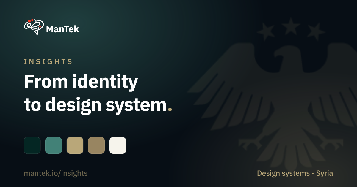
Governments are judged, more and more, by whether their websites and apps actually work. On 3 July 2025 Syria launched a real national visual identity: a golden eagle, a three-star flag, the Qomra Arabic typeface, and a downloadable logo pack. What it does not yet have is the thing that turns an identity into consistent, accessible public services: a government design system. We studied how fourteen national governments solved exactly that, and what a modern, RTL-first system would take. This is our independent read, offered as a point of view and a case study, not an official standard.
How to read this. Every claim below is labelled so assumptions are never dressed as facts: 🟢 OFFICIAL (verified in a Syrian government source), 🔵 OBSERVED (visible on a live government site, not formally documented), and 🟠 RECOMMENDED (our best-practice proposal, not an existing Syrian standard). Nothing here has been fabricated, and this analysis is independent: it is not affiliated with, authorised by, or endorsed by the Syrian government.
A real identity, no system yet
The identity is real and official. 🟢 A complete national visual identity, the golden eagle emblem, the three-star flag, the Qomra typeface, and a downloadable logo pack, was launched on 3 July 2025 and published at syrianidentity.sy.
But it is only a brand, not a system. 🟠 There is no brand-guidelines manual, no colour and spacing specification, and no digital design system or component library. Ministries are adopting the eagle unevenly, on different technology stacks, with different golds and no shared interface. 🔵 One ministry runs the identity beautifully; another still serves Arial and no eagle at all. That gap, between a symbol and a system, is the whole opportunity.
How fourteen governments do it
We benchmarked fourteen national government design systems, from the UK’s GOV.UK and the United States’ USWDS to Germany’s KERN, Canada’s GCDS, Singapore, the Netherlands, Ireland, India’s UX4G, and the UAE’s aegov. 🔵 The mature ones converge on a handful of moves worth copying:
- A web-components core with framework wrappers (Canada, Singapore, Ontario), so React, Vue, Angular and plain HTML all share one accessible, correct implementation instead of four diverging ones.
- Design tokens as the single source of truth, in three tiers (brand, then semantic, then component, the Netherlands pattern), so many agencies can re-skin one system without forking it.
- A “do and don’t” plus an accessibility note on every component page (the UK and US), the single most-copied documentation pattern in the field.
- Flutter and RTL from day one (India’s UX4G), because Arabic is right-to-left and government is mobile-first.
The failures are just as instructive. 🔵 Australia and New Zealand built good systems and then lost them when the funding and governance went away; both decayed into frozen alphas or community forks. The US system has thinned to roughly one maintainer, so its design kit now lags its code. Saudi Arabia has a strong mandate but a thin, stale public codebase. The lesson is blunt: a good first release is easy; keeping it alive is the hard part.
The core recommendation: two layers, one portal
🟠 Germany offers the right template. Its Digitale Dachmarke separates a brand and identity layer (the umbrella mark, a unified domain scheme) from a coded design system (KERN) that lives beneath it. The UAE proves the same split from the other direction: the brand portal the design world often cites is only the identity layer; the actual UI system lives separately at designsystem.gov.ae.
Syria should build both, as one portal with two clearly distinct products:
| Layer | What it governs | Status |
|---|---|---|
| National Brand | Logo and emblem usage, flag, colour, typography, photography, tone, misuse rules | The July 2025 identity 🟢 |
| Design System | Design tokens, UI components, patterns, page templates, code packages, accessibility | To be built 🟠 |
Keeping the two separate but linked is what lets the identity stay pristine while the engineering beneath it evolves.
What a modern, RTL-first system needs
🟠 Everything here is a recommendation, anchored to the two brand values that are actually load-bearing, the dark green #042623 and the gold #B9A779 (🟢🔵 both appear in the official logo files and on live ministry sites), and to the Qomra typeface.
The typeface is where the identity is most exposed. 🟢 Qomra is a commercial Arabic typeface, designed by Ahmed Zaza and released before the identity launched; it is licensed for sale like any other. Syria adopted it, it was not built for the state. That leaves two gaps. The state owns no typographic asset of its own, so anyone can license the same face and set text that looks official, which is precisely the distinctiveness and forgery-resistance a national wordmark is meant to carry. And a commercial licence sits awkwardly with the one thing a design system must do, hand its font to everyone implementing it: ministries, contractors, third-party developers.
🟠 The answer is not a different font. It is a typographic asset with governance around it:
- Commission a typeface exclusively for the state, designed and owned for government use, not adopted from the market.
- Bind it to a usage agreement, so it cannot circulate freely or be used to impersonate official material.
- Deploy it through procurement, requiring it on government machines as a supplier condition, so no ministry solves this alone.
- License third parties explicitly, with published terms, so agencies building on the system can ship it lawfully.
- Cover implementers from day one. A design system that cannot deliver its own font to those building on it breaks at the first implementation.
Until such a typeface exists, an open fallback (Noto Naskh Arabic, IBM Plex Sans Arabic) keeps the system usable and distributable. That is a stopgap for the distribution problem, not an answer to the sovereignty one.
On top of that anchor, the foundations are well-trodden: a three-tier token model; a spacing and grid scale; motion that signals state and respects reduced-motion; and, non-negotiably, RTL and LTR from one codebase using logical CSS properties so Arabic and English never fork. The accessibility target should be WCAG 2.2 Level AA, matching the UAE and UK and a notch above most peers.
Components then ship on a single contract, the pattern the UK and US made standard: every component documents its purpose, variants, states, accessibility, do-and-don’t, and responsive behaviour. A button is not “done” until its focus ring, its 44-pixel target, its loading state, and its RTL mirror are all specified.
Governance is the real predictor
If there is one thing to over-invest in, it is not the components. 🟠 It is governance. Australia and New Zealand are the warning: good systems, abandoned. Syria’s system needs a funded, permanent owning team, a Digital Standards Unit with a mandate over both layers, treated as a product with maturity labels (experimental through stable), mandatory accessibility sign-off before anything ships “stable”, and adoption made a requirement for new government services. That is the difference between a launch and a lasting standard.
A staged path
🟠 The work sequences naturally, so each release is independently useful:
- MVP (roughly 0 to 4 months): commission the missing brand-guidelines manual with the identity team, ratify the official colour and type spec, ship design tokens, a portal skeleton, and ten core components in web components and React, WCAG 2.2 AA, RTL from day one.
- Version 1 (roughly 4 to 10 months): the full component library and every framework wrapper, a Figma library with token sync, core page templates, full documentation, and the governance body stood up.
- Future (10 months on): Flutter and native mobile, dark mode, a unified national portal built on the system, and a compliance programme for agencies.
Method, and why it is labelled
We wrote this the way a government proposal should be written: every factual claim is linked to a source and labelled 🟢 OFFICIAL, live-site detail is labelled 🔵 OBSERVED, and everything we propose is labelled 🟠 RECOMMENDED and offered for ratification, never asserted as an existing Syrian rule. No colour, measurement, or asset has been invented, and one rule belongs inside the system itself: the official eagle must always be taken from the official asset pack, never redrawn.
The full analysis, the complete fourteen-system benchmark, the detailed specification, and every source, is in the companion repository on GitHub. Syria has the hardest part already: a real, dignified identity. Turning it into public services that work, in Arabic first, is a design-system problem the world has solved before, and can be solved here.